Essential Checklist for Creating High-Value Content
September 23, 2025 at 1:09 amKey Digital Marketing Trends to Watch in 2021 (Part 1)
September 23, 2025 at 1:12 am

As marketers, be it ads, emails, landing pages, and so forth, we often spend so much time to perfect our marketing copy. We sometimes don’t give Call-To-Actions (CTAs) enough attention. Research shows that your CTA is just as important as your marketing copy.
According to ConversionXL Institute, 97% of the people pay attention to the headline of a piece of content. 60% will scroll to the bottom of an article. And, most of them are more likely to skim through rather than read your content). This shows that more people are looking at your CTA than your content. What’s more surprising is that more than 70% of small business websites don’t contain any CTA.
For social media, the implication of having a CTA much more pronounced. According to Adroll, adding a CTA button to Facebook ads resulted in a 285% boost in conversions.
In this post, I will be sharing with you six quick tips to try to increase your CTAs performance.
1. Arouse the curiosity of your audience
When dealing with social media, design your CTA to arouse your audience’s curiosity.
Although many factors can affect people’s response to your social media CTAs, Adroll found that the best performing CTAs use curiosity.
In terms of CTR, their review found that CTAs such as “Learn More” performed better than other CTAs such as “Shop Now”, “Download”, “Sign Up” and “Book Now.”
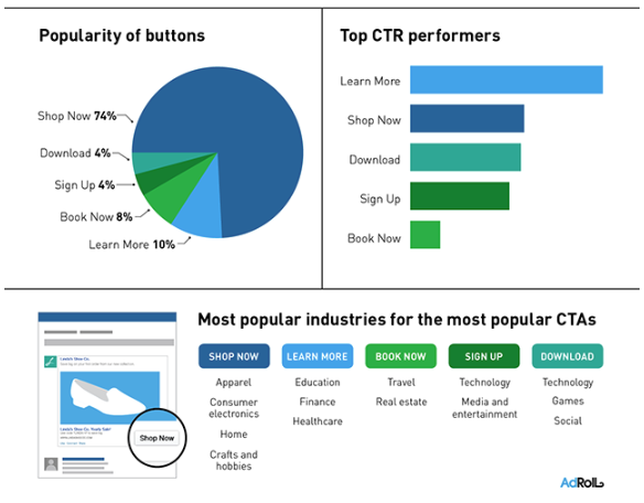
CTAs that offer an incentive such as a free download was also found to be equally effective.
2. Use an Anchor Text CTA
Research shows that you will be able to get better results when you use an anchor text CTA.
According to HubSpot, they found that using an “anchor text CTA” resulted in significantly more leads than using a generic CTA.
In their analysis, HubSpot found that using anchor text CTAs increased their conversion rates by up to 121%. Up to 93% of the leads generated from the content on their blog came from anchor text CTAs.
That being said, “What is an anchor text CTA?”
An anchor text CTA is a standalone text-based CTA in a piece of content that links to another landing page (typically for conversion into leads). Generally, it is styled in H3 or H4 to help it stand out when compared to other parts of the content’s copy.
See below for an example of an anchor text. (Click here to get started with our free market research kit.)

3. Experiment with different colours
You often come across the debate on “What’s the best CTA button colour?”
To some, the best CTA button colour would be red. Some argue that orange or even green is the best and so on. You get the point. There is no “best” or “right” CTA button colour.
As a general guide, you may follow this infographic as shown below from ConvertKit.
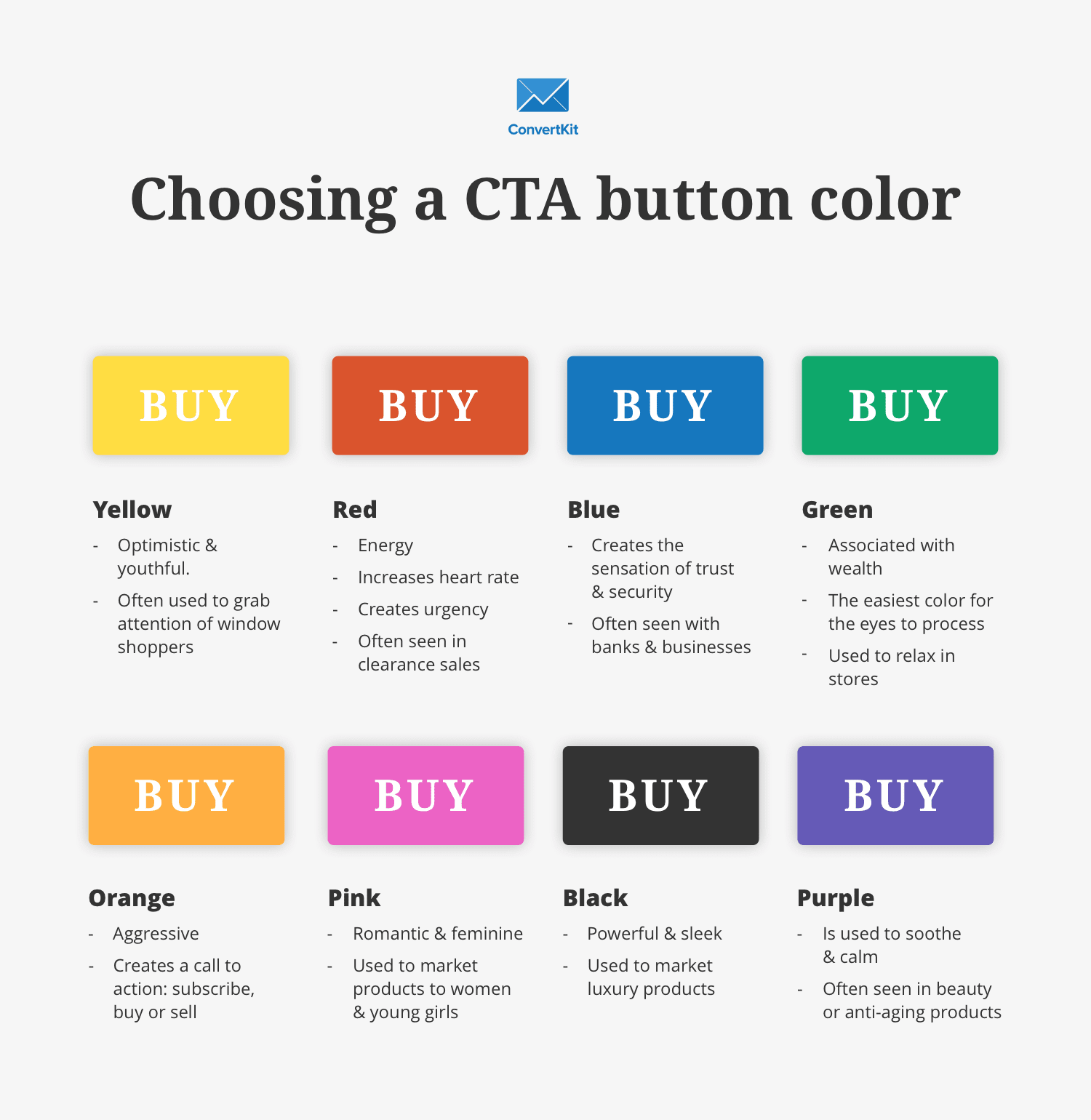
However, the most important thing is that your CTA should never blend in with your site’s design and colour. You should always use a colour that contrasts with the colour of your website.
4. Communicate in first-person
The quickest win to improving your current CTAs is to write your CTAs in first person.
According to ContentVerve, merely changing the word “your” to “my” in a copy resulted in better conversions.
One of their experiment had the opposite effect of intended, the CTA version, which used “My” converted 24.91% better than the CTA which used “Your.”
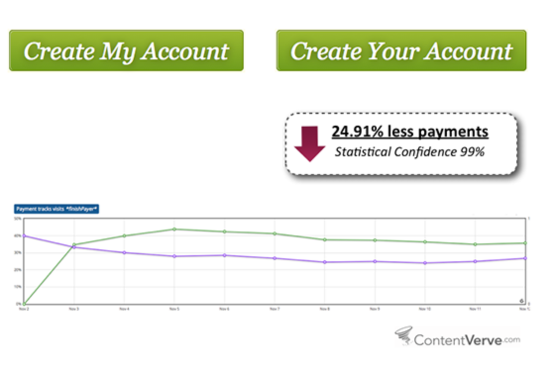

Also in another experiment involving a PPC landing page for Unbounce, changing the CTA from “Start your free 30 trial” to “Start my free 30-day trial” resulted in a 90% improvement in click-through rates.
Click here for a DIY guide on how to improve your conversions in 60 days.
5. Personalise your email CTA
Perhaps a well-known fact amongst many marketers, we usually only personalise the subject line. Now, with the abundance with marketing automation software and artificial intelligence, it is also possible to personalise your email CTAs.
In a study done by HubSpot, they analysed over 300,000 CTAS over six months, revealing how impactful personalised CTAs can be. In this study, the CTAs are grouped into three categories:
- Basic CTAs – CTAs that are fixed and do not change regardless of individual differences among visitors to a website.
- Multivariate CTAs – CTAs with split-testing against a portion of traffic to a website to identify a winning CTA.
- Smart CTAs or personalised CTAS – CTAs that are customised and targeted to different user segments based on several variables such as location, gender, history, purchase history.
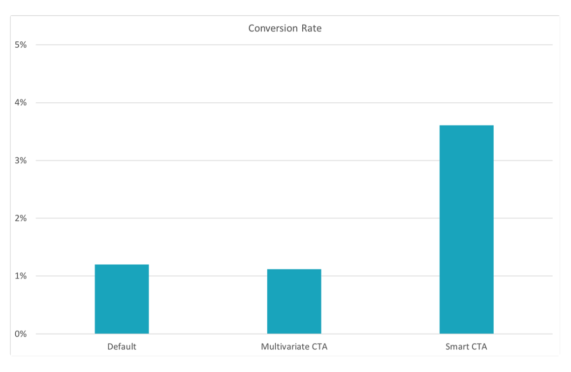
HubSpot found that (Group 3) personalised CTAs have a better conversion rate than (Group 1) Basic CTAs and (Group 2) multivariate CTAs. To be specific, the study revealed that personalised CTAs converted 202% better.
6. The size of your CTA matters
Yes, you probably already knew it. Bigger is always better, at least in the case of CTAs.
A case study by WiderFunnel demonstrated that increasing the size of a CTA button on a landing page resulted in a 32.5% increase in conversions.
Conclusion
These 6 quick tips for CTAs is likely to affect to improve your conversion rates. However, these are techniques that needs to be tested and does not necessarily work for all websites, brands and audiences. And before you even start testing your CTAs, ensure that you have set up your tracking analytics. Tracking and monitoring performance metrics is just as crucial, if not more. Just like your CTAs, marketing copies and graphics, it’s always good to use A/B testing!
{{cta(‘818ec33b-94a4-4e18-ab96-5edcaa4fa837’)}}