
How to Strategically Post on LinkedIn Pulse: The Why, What, and How
October 5, 2025 at 10:57 pmThe Importance of Header Tags in Boosting Your SEO Performance
October 5, 2025 at 11:00 pm
Let’s have a look at a typical landing page form.
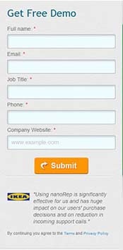
Image Source: Unbounce
Everything looks good. You’ve filled in your personal information and are ready to go…
Until your eyes reach the bottom.
“Submit,” the bright orange button coldly says.
“Hang on, what am I submitting to? It doesn’t say anything and I’m too lazy to dig around for more information.”
Your visitor hesitates and leaves your page, losing you a potential hot lead.
“Submit” implies you didn’t bother to change the default text on your form template.
“Submit” is bland, even intimidating.
Does your business want to be seen as bland or intimidating?
When it comes to professional landing pages, the smallest details can make a huge difference. According to HubSpot Singapore’s analysis of over 40,000 HubSpot customer professional landing pages, call-to-action buttons labelled “submit” performed 3% worse than buttons without a “submit” label.
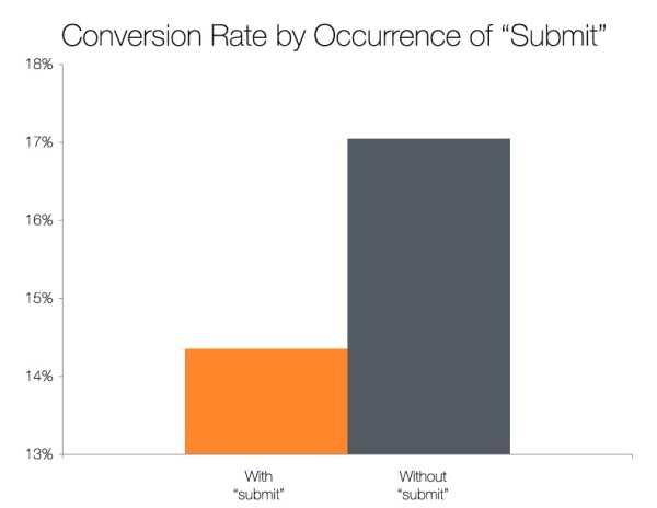
Image source: HubSpot Singapore
If submit is so bad, what are better words to use?
A subsequent context-less word preference test done with 400 people by HubSpot Singapore revealed people preferred words suggesting less investment of time and effort. “Click Here” and “Go” were the most favoured, whereas words like “Download” and “Register” fared the worst.
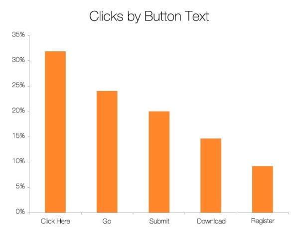
Image source: HubSpot Singapore
These words still sound a little generic, don’t they?
Personalisation of your call-to-action to your offer is the best approach.
People generally fear the unknown and want to know why they are being asked to do something. Visitors want to know what they will get in return for giving you their personal information.
So how can your call-to-action button aid this process of converting visitors into sales leads instead of distracting?
Ensure your call-to-actions are clear and answer these 2 concerns: ‘what’ and ‘why’. Clearly communicate the benefits your lead is getting in return when they click on your call-to-action.
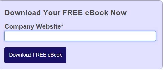
On our website, our call-to-action button copy clearly states the benefit you will receive when you click on the button (a free e-book).
In another example, PriceCharting.com observed an astounding 620.9% increase in click-through rates when they changed their call-to-action button copy from a generic ‘Download’ to a clearer and more relevant ‘Price Guide’ (read more of the PriceCharting.com case study here).
Ensure every element of your professional landing page to help communicate how the user benefits from your offer, including your call-to-action. Small tweaks can result in the biggest improvements in conversion rates.
{{cta(‘d54cc04e-3cdc-4b79-845c-bc391be70411’)}}