Key Mobile SEO Mistakes You Should Avoid
September 8, 2025
Tailored Advertising: ABM Tactics for Asian and Singaporean Markets
September 8, 2025
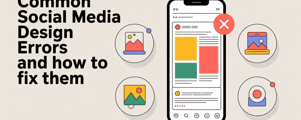
Are you looking for ways to improve your social media presence? Want to learn how to get your social media images looking perfect every time?
Read on seven social media design mistakes you should avoid:
Your images are blurry
If your image file is too small and has to stretch, this can result in poor image quality and pixelation. And unfortunately, pixelated images tend to make your brand look unprofessional and are much less likely to be shared. It is always better to upload a larger, high-resolution image than a small one. This is because shrinking is better than stretching!
Your fonts are hard to read
It can be tempting to choose the prettiest font in your collection. But pretty is not always the best choice for social media. Your followers are browsing quickly, and they want typography that is clear and easy to read. You have limited time to get your message across, so make It count!
You are choosing the wrong colours
The colours you choose in your social media designs should reflect the style of your business. While your base colours for your branding should evoke the right feelings, you should also be aware of how they appear on the screen.
Ask yourself these questions:
-Are the colours easy on the eyes?
-Do the colours work well together?
-Are the colours consistent with your brand?
You are limiting your viewing options
When posting to social media, you need to know your audience. How are they viewing your content? Your image looks good on a desktop computer but how does it look on a mobile phone?
Remember, your post might not be a one-size-fits-all that will work on all social media platforms. Your audience may vary, and the style of your content should be adapted.
You are using stock photos
When it comes to social media, authentic, genuine content is the key to success. Your followers want to see the voice behind your brand., and you can do this by taking your own photos.
This is to say you can not ever use stock photos – and stock photo photography has come a long way from the overly posed versions that come to mind – just make sure to include eye-catching images with personality that match your brand.
You are using every inch of space
Graphic designers understand that less can be more. Negative space is the area that surrounds the objects and text in your images. The background is just as important as your words and imagery!
A common mistake is to fill up the entire graphic with letters and shapes. This can look cluttered and can confuse your followers. Whether it is a logo, header, or post, try embracing space.
You are not using grids
When we look at writing, we subconsciously expect it to flow in a certain way. Another common social media design mistake is positioning text at random.
If you don’t get the spacing and alignment right, it can distract the reader and make your profile page look rushed and messy.
For more interesting and informative content, subscribe to our blog!


