
10 Must-Know Google AdWords Tips for Better Campaign Performance
October 5, 2025 at 11:06 pm
How Small Businesses in Singapore Can Succeed with Smart Social Media Marketing
October 5, 2025 at 11:08 pm
Numerous authorities and experts in blogging commonly recommend placing call-to-action buttons “above the fold” for best results. Originating from the newspaper industry, businesses used this principle in their website design for two major reasons:
1. Slower Internet speeds and computer processing power
2. User awareness of scrolling behaviour on web pages
These factors required businesses to be selective of the content they placed on their web pages to maximise the audience they would receive.
What is the “Fold”?
“The fold” is the space where your web page is viewable to your user without having to scroll down. Heatmap studies indicate visitors spent 80% of their time focusing on the content above the fold. Although website visitors do scroll down the page, viewing time of the page decreased sharply when they went below the fold.
According to best practices, keeping vital information above the fold ensures users see your call-to-action button and quickly understand your page. Anything “below the fold” will only be viewed by 50% of people who visit your page.
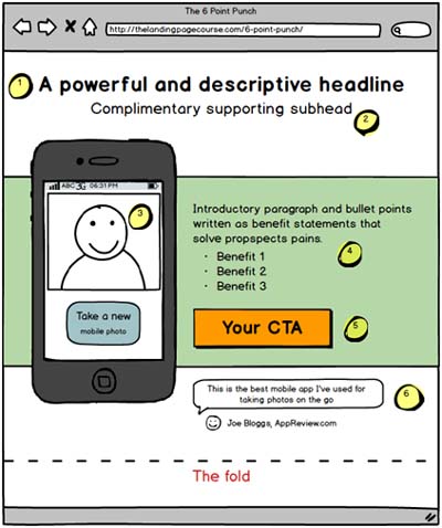
Image: Landing page setup according to best practices | Source: The Landing Page Course
These analyses suggest keeping your CTAs “above the fold” would do best.
CTAs Below The Fold
But what if I told you CTAs below the fold can work just as well as those above the fold, if not better?
Marketers have also created successful CTAs that depart from the “above the fold” best practices. In the same heatmap study, people can be motivated to continue reading down a page if:
1. The layout encourages scanning
2. The initially viewable information makes them believe it will be worth their time to scroll.
The AIDA model; or attention, interest, desire and action are four factors your website visitors consider when making a decision to take action as they interact with your professional landing page.
- Attention: Capturing attention of your visitor with a relevant and punchy headline
- Interest: Generate interest with smart copy or a well-placed video or visuals
- Desire: Create desire by using features and benefits to appeal to your visitor”s needs
- Action: A strong CTA to complete the marketing story the other 3 elements were setting up. To convince your visitor your solution is the best suited to meet their needs
The AIDA format allows your professional landing page to tell a story aided by crisp design, smart copy and clearly indicated navigation to guide visitors to continue reading.
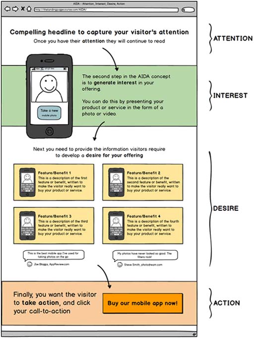
Image: Landing page setup according to AIDA formatting | Source: The Landing Page Course
Benefits of below the fold CTAs
High-speed Internet, touchscreen devices and increased computer processing power have made scrolling become second nature. Therefore, do CTAs really need to be above the page fold?
CTAs below the fold allow you more room to explain complex products offers. Sufficiently addressing visitor”s queries and doubts in your landing page ensures they are excited and ready to click the CTA button when they reach the bottom of the page.
If visitors don’t understand your product or have doubts, they’re not likely keen to buy your product.
Positioning the CTA lower on the page can work better to give prospects time and space to digest the information needed to make an informed decision.
In an A/B testing of two Boston Globe sign up pages; with the control CTA above the fold and the alternative CTA below the fold, testers found no significant differences between the two treatments.
In another example by Content Verve, moving the CTA below the fold increased conversions by 304% (Control) than a CTA above the fold (Treatment A). These results have been replicated by Certified Knowledge.
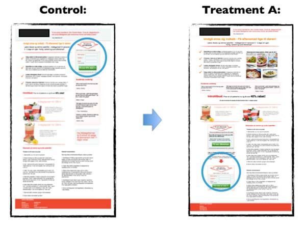
Source: Instapage
So why is “above the fold” still considered best practice in landing page design? Below the fold CTAs can perform just as well as CTAs above the fold, if not better.
Ideal CTA Placement Depends on Your Offer Complexity
The below graph by KISSmetrics illustrate the correlation between the complexity of your offer and the best place on your professional landing page to put your CTA.
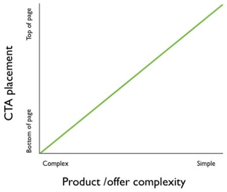
Source: KISSmetrics
Placing the CTA above the fold works best if the product offer is simple and the prospect does not have to do a lot of thinking to make an informed decision.
Alternatively, CTAs below the fold work better if the product offer is complex. Prospects may have more questions that need to be either explained in your landing page copy or thought over before making an informed decision.
Rushing to convince your prospects can be counterproductive. Asking for a commitment before establishing the value of the offer to your prospect will kill your conversion rates. Ultimately, your conversion rates are influenced by how motivated your prospects are to click your CTA.
Page scrolling is now second nature to consumers but they are also becoming more discerning. Marketers should consider if their CTAs are positioned where they are sufficiently compelling such that prospects are motivated to take action, rather than worrying about placing CTAs above or below the page fold. Thorough A/B testing of your landing page will help to find out what is best for your offer promotion.
{{cta(‘d54cc04e-3cdc-4b79-845c-bc391be70411’)}}