
Email Marketing in Singapore: 8 Powerful Email Types That Work
August 19, 2025 at 3:22 pm
Make Your Slides Stand Out: 4 Presentation Design Tips
August 19, 2025 at 4:37 pm
 I can’t emphasize enough on how powerful visuals are for bringing across a message, showing data and sharing information. They capture the readers’ attention, deliver messages clearly, and are simple to create. More importantly, readers can mentally retain visuals better than text, and this increases impact.
However, there is always the case of an adverse effect when your data or message cannot be presented clearly because of a wrong use of tools to create your visual content. To avoid confusion, you need a good design, and choose the right type of representation (i.e. correct types of charts and graphs).
Compiled below are some common visualization mistakes that you can avoid while creating graphs and charts to present data and information.
1. Pie chart segments
Pie charts are one of the most commonly used tools to represent data. This chart is good for representing percentages and proportions. However, they are often designed “too much” and become over-complicated. The segments of the chart should be ordered intuitively, and should not include more than 5 segments.
While placing your figures into the pie chart, the largest section should always be at the 12 o’clock, going clockwise. From there, you have 2 options. You can either place the second largest section on the right or left of the biggest section. As for the remaining sections, place them in descending order after the second largest section.
2. Lines of a line chart
You may be thinking that dashed lines and dotted lines can allow readers to easily differentiate the groups. Unfortunately, they can also be distracting. The best method for differentiating line charts are to use solid lines (same width) with different colours for each group.
3. Arrangement of data for bar graphs
Your different groups of data should be presented in a logical and systematic way so as to ensure they are clear and easy to understand. You may choose to place them in an alphabetical order or value.
4. Visibility of data in area charts
You can have a fanciful design, but be very sure that your data is not lost or covered by your design. There is no point in having a beautiful design with an incomplete set of data as what readers’ perceive would be different from what you originally wanted to show. You may use different transparency in the area charts to make sure that all data can be seen and read.
5. Readers doing the work
Make the experience of reading information and data stress-free by including necessary graphic elements for your graph. For example, adding a line indicating the trend to a scatterplot or adding a faint dotted line across the bar graph to illustrate the value.
6. Misrepresentation
You need to check that all representations are accurate, relative and shown to scale. For example, a circle representing a figure of 100 cannot be 3 times the size of one which is representing 50.
7. Colours on a heat map
Certain colours will appear much brighter and more attention-grabbing as compared to other colours. To avoid confusing your reader with your messy representations, use a single colour with different shades to illustrate the difference.
8. Width of bars
Keep the width of your bars and space between your bars consistent as it helps your reader view your data. The space between bars should be ½ of your bar width.
9. Making comparison difficult
Readers should be able to compare values easily with just one glance as that is the whole point of using visuals—easy and effective. Do make sure your data is presented conveniently (side by side) for your readers to compare.
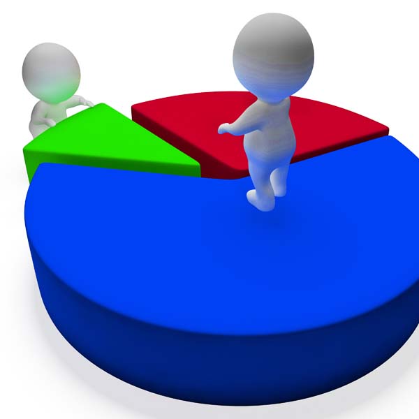
10. Using 3D
They may look really cool and hence some are thrilled to use 3D in their graphs. However, 3D shapes can distort perception and skew data. Does the front or back of the bar represent the value? To avoid misinterpretation, you may want to stick with the clean and flat designs.
On top of using charts and graphs to convey information, you can also use infographics to capture information and make your content easier to share, which is important to Inbound marketing.